L From dark to light
0% is black; 100% is white. In between, L describes perceived lightness. Try it for a theme’s tonal steps.
0% · dark100% · light
 Visualise OKLCH
by shreyam1008
Visualise OKLCH
by shreyam1008
OKLCH extension + interactive explainer by shreyam1008
Visualise OKLCH previews OKLCH colors inline in VS Code, Cursor, Windsurf, VSCodium, and Open VSX-compatible editors, while this site doubles as a live, interactive guide to why OKLCH is a better way to write color.
Inline preview
background: oklch(62.8% 0.258 29.23);Interactive color converter
Move a slider or type a color in any format. All six representations update together. Change just L to see how perceived lightness moves RGB, HEX and HSL below.
Anatomy of your color
oklch(
62.8%L · lightness0.258C · chroma29.23H · hue/100%opacity · optional)
0% is black; 100% is white. In between, L describes perceived lightness. Try it for a theme’s tonal steps.
0 removes the color, leaving gray. Increase C to add colorfulness. The displayable limit depends on L and H.
Hue is an angle: 0° and 360° meet. Rotate it to explore color families. At C = 0, hue has no visible effect.
Each ramp varies only its named channel before conversion, holding the others at your selected values. Ramps are opaque sRGB previews; chroma is reduced where needed to fit. Alpha controls transparency: 0% is invisible, 100% is opaque.
Explore further: OKLCH.com’s graphs and gamut tools · MDN’s CSS reference.
Current swatch
Drag around the ring. L and C stay fixed.
0° at the top, clockwise. Arrow keys ±1°; Shift ±10°. Ring shows reference hues at L 72%, C 0.14, fitted to sRGB. Center is your color.
RGB · 0–255 · sRGB fallback
Up = lighter. Right = more vivid. Drag the ring to explore.
The colored shape is sRGB at this hue—not a fixed triangle. Arrow keys adjust C and L; Shift makes larger steps. Stripes are unavailable in sRGB, not additional displayable colors.
oklch(62.8% 0.258 29.23)
#ff0000
rgb(255 0 0)
hsl(0 100% 50%)
Everything runs locally in your browser. No color data is uploaded.
A fallback is a version that fits a target color range. Here the target is sRGB. We reduce OKLCH chroma when needed, keeping lightness and hue fixed; your original value stays untouched until you choose Fit to sRGB.
The original preview depends on your browser and screen, so the two may look alike. These previews preserve alpha over the same checkerboard. This tool’s chroma-reduction policy is not a guarantee of identical browser gamut mapping.
The first CSS declaration is also a syntax fallback for browsers that cannot parse OKLCH. Browser support and display gamut are separate issues.
Both describe lightness, chroma and hue. CSS lch() is CIELCH, based on CIELAB with a D50 white point. oklch() is based on Oklab with D65. A hue angle, chroma number or lightness value cannot simply be copied from one to the other.
For example, 100% chroma means 150 in CSS LCH, but 0.4 in OKLCH. Those percentage references are not gamut limits.
This read-only value converts the fallback—not the original wide-gamut color. It is separate from the six editable formats above. Read the CSS color definitions ↗
CSS snippet
:root {
  --brand: oklch(62.8% 0.258 29.23);
}
Try this with your color
Raising OKLCH lightness moves brightness more evenly than HSL lightness, which often shifts perceived saturation at the same time.
One channel moves. Watch the rest.
These curves sweep OKLCH L from 0% to 100%, holding your chroma and hue fixed. RGB values follow nonlinear curves, not equal increments. Near the sRGB boundary, chroma reduction can also create bends and plateaus. The values are deterministic—not random.
Chroma 0.258 · hue 29.23° stay fixed
Read left to right: lightness increases. Read up: the RGB channel increases. The shaded slice compares the two swatches above. Drag across the chart, or use the lightness slider.
Channel differences compare the current color with a color 10 lightness points darker, at the same C and H.
| OKLCH L | HEX | RGB | Δ RGB from previous row | sRGB |
|---|
Why It Wins
Uniform steps feel like actual steps.
Equivalent hue and saturation, less predictable perception.
Color formats & sRGB fallbacks
oklch(62.8% 0.258 29.23)
#ff0000
rgb(255 0 0)
hsl(0 100% 50%)
Place the cursor inside a color and run Visualise OKLCH: Edit Color in OKLCH from the command palette or right-click menu. Adjust L, C, H, and alpha independently, see the sRGB boundary, and Apply one undoable edit. The built-in picker remains available from the color swatch for quick sRGB edits.
OKLCH reads like design intent. Lightness, chroma, hue, alpha. The channels map cleanly to how people tune real systems.
Theme scales and semantic colors are easier to build because brightness shifts do not scramble everything else as aggressively as older models.
OKLCH is already everywhere modern frontend teams care about: Tailwind, design tokens, CSS color specs, and editor tooling.
The extension’s custom picker
This working browser demo uses the extension’s actual picker HTML and client code—not a mock screenshot. Try the plane, L/C/H/alpha controls, Fit to sRGB, Reset and Apply.
In VS Code, place your cursor inside an OKLCH value, then right-click and choose Visualise OKLCH: Edit Color in OKLCH, or run it from the command palette.
The demo has no editor connection: Apply changes only its in-memory example. In the extension, Apply makes one undoable document edit. VS Code’s theme may change the panel’s appearance.
Open the picker demo at full size ↗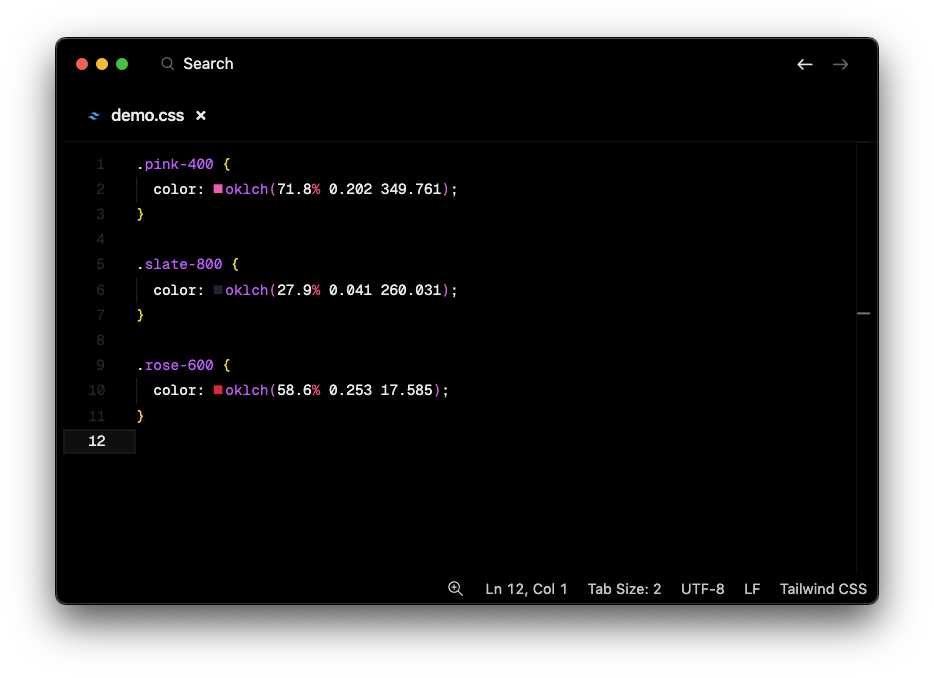
Existing project screenshot: inline color swatches beside OKLCH code. This is an older, pre-2.0.5 example—not a screenshot of the current 2.1.0 OKLCH editing panel.
In 2.1.0, place the cursor inside an OKLCH value and run Visualise OKLCH: Edit Color in OKLCH. That opens the independent L/C/H editor with its gamut map. The inline swatch also offers VS Code’s native picker.
From playground to editor
Use the playground without installing anything. Add the extension when you want inline previews and the built-in picker while editing CSS.
In VS Code’s Extensions view, search for Visualise OKLCH by shreyam1008, or run:
code --install-extension shreyam1008.visualise-oklchUsing an Open VSX editor such as VSCodium? Install from the Open VSX listing. For VS Code, use the Marketplace listing.
:root {
  --surface: oklch(96% 0.015 255);
  --accent:  oklch(60% 0.16 255);
  --ink:     oklch(25% 0.03 255);
}

.card {
  background: var(--surface);
  color: var(--ink);
  border: 1px solid var(--accent);
}
Paste into a CSS file, place the cursor inside a color, and run Edit Color in OKLCH. Keep H at 255 for a shared color family; adjust L for tone and C for a quieter surface or stronger accent. Stripes mark colors outside sRGB; Fit to sRGB reduces chroma when you want a displayable sRGB value.
Check text contrast against its actual background before shipping. OKLCH lightness alone does not guarantee accessible contrast; transparency and gamut mapping also affect the rendered result.
Behind The Scenes
The extension reuses one decoration type per rendered swatch instead of allocating one per match, cutting editor churn where the old implementation was slowest.
Small files scan fully. Large files switch to padded visible-range scanning, so the extension stays useful without touching the whole document on every change.
The repo validates with both `typescript@rc` and `tsgo`, alongside Bun tests, coverage, and VSIX package checks.
The project stays small, transparent, and easy to ship: source on GitHub, packages on Open VSX, and a plain HTML docs site that deploys fast.
Test And Ship
bun install
bun run verify
bun run coverage
bun run package
Tests cover parsing, scanning, docs/package metadata, range strategy, and integration fixtures under the `tests/` folder, including the native picker helper paths and OKLCH presentation formatting.
bun run changeset
git tag vX.Y.Z
git push origin main --tags
# Then publish the matching GitHub release
Site changes on main deploy to Pages. Publishing a matching GitHub release builds the VSIX and triggers store publishing when registry authentication is configured. A main push or tag alone does not update either store.